
Usability Testing & Practice Theory
MagnificentH
Role
Usability Researcher & UX Designer
Team
4 Usability Researchers & Designers
Timeline
7 weeks
Platform
Web
Tools
Figma, Miro, PrivatePanels, Google Workspace
The TLDR: A platform built to protect creators, that creators couldn't understand
MagnificentH is a micro-museum platform built to protect and celebrate human creativity in an era of AI-generated content. But early users couldn't tell whether it was pro-AI or anti-AI, couldn't find the information they needed, and left confused.
Our team of four conducted 8 remote moderated usability interviews to surface those friction points and deliver redesign recommendations directly to the client. I owned the AI clarification redesign, the section with the highest user confusion, and led a design-consistency pass across the team's mockups before delivery.

The Problem: A Platform Creators Wanted to Trust, But Couldn't Quite Understand
MagnificentH had a real idea and a real audience: artists, hobbyists, and cultural enthusiasts who wanted a human-curated alternative to AI-flooded creative spaces. But the website was working against them.
The home page was long and overwhelming, the monetization process was unclear, and their messaging around artificial intelligence was contradictory enough that users couldn't tell whose side the platform was on.
The client knew something felt off. They just didn't know what or where.
Research: Eight Conversations That Showed Us Where MagnificentH Was Losing People
We recruited 8 participants through PrivatePanels matching two profiles: hobbyists (artists, writers, photographers) and travel and culture enthusiasts (the people most likely to actually use a micro-museum platform). I moderated 2 of the 8 interviews and co-developed the screener, questionnaire, and PrivatePanels filters used to recruit participants.

After interviews wrapped, we used affinity mapping to synthesize across sessions. Four patterns came through clearly:
1. The home page was overwhelming before it could explain.
The large red header took up prime real estate without telling users what the platform actually was. Most participants scrolled past critical information or gave up locating it.
2. Monetization was murky.
Users could find the monetization page, but couldn't piece together what the process actually looked like for them as a creator. The options felt like they were written for someone who already understood the system.
3. Articles lacked visual context.
The text was fine, but without supporting images, users couldn't connect with content about specific locations and artworks. It felt disconnected from the visual richness of the rest of the site.
4. The AI messaging was actively confusing users.
This was the sharpest finding. Participants weren't just unclear; they were contradicting themselves within the same interview.
"This [website] is like an AI archive… like a digital art archive for people who want to do AI art!"
"Are they anti-AI? Or do they just, like, allow people to use AI?"
The platform's actual position- protect creators first and allow optional opt-in monetization through AI licensing- was buried across multiple pages in conflicting language. For a platform whose entire value proposition depends on creators trusting it with their work, this was a critical failure.

The Design: Four Problems, Four Recommendations, and the One I Owned
The team produced redesigns for all four findings.
My teammates led the home page restructure (prioritizing imagery and clearer information hierarchy), the monetization page simplification, and the article layout improvements. I did a design consistency pass across all four deliverables before we presented, checking type sizes, spacing, and color usage against the site's existing patterns to make sure our recommendations felt like they belonged in MagnificentH's world, not dropped in from somewhere else.
My primary ownership was the AI clarification problem, which I'll walk through in detail.
My Design: Clarifying MagnificentH's Stance on AI
A Constraint: A small team manages the website without a software engineering background or UX background.
MagnificentH was built and maintained by someone without a software engineering or UX background. Any recommendation I made had to be realistic for them actually to implement. That ruled out complex interactive components or anything that required significant technical overhead; the solution had to live within what they could build.
What I was solving for: Users couldn't find information about their AI stance and when they did, it was confusing.
Two things were broken: users couldn't find information on AI anywhere intuitive, and when they did find it, the messaging contradicted itself.
The fix needed to consolidate scattered information and say one clear thing.
Decision point: Where should the information live?
During testing, I noticed something useful: when participants wanted to understand the platform's AI policies, they naturally navigated toward the FAQ section or looked for an "About" page. They weren't looking for a hidden section buried inside a Resources dropdown. That told me the solution wasn't just rewriting the content; it was relocating it to where users already expected to find it.
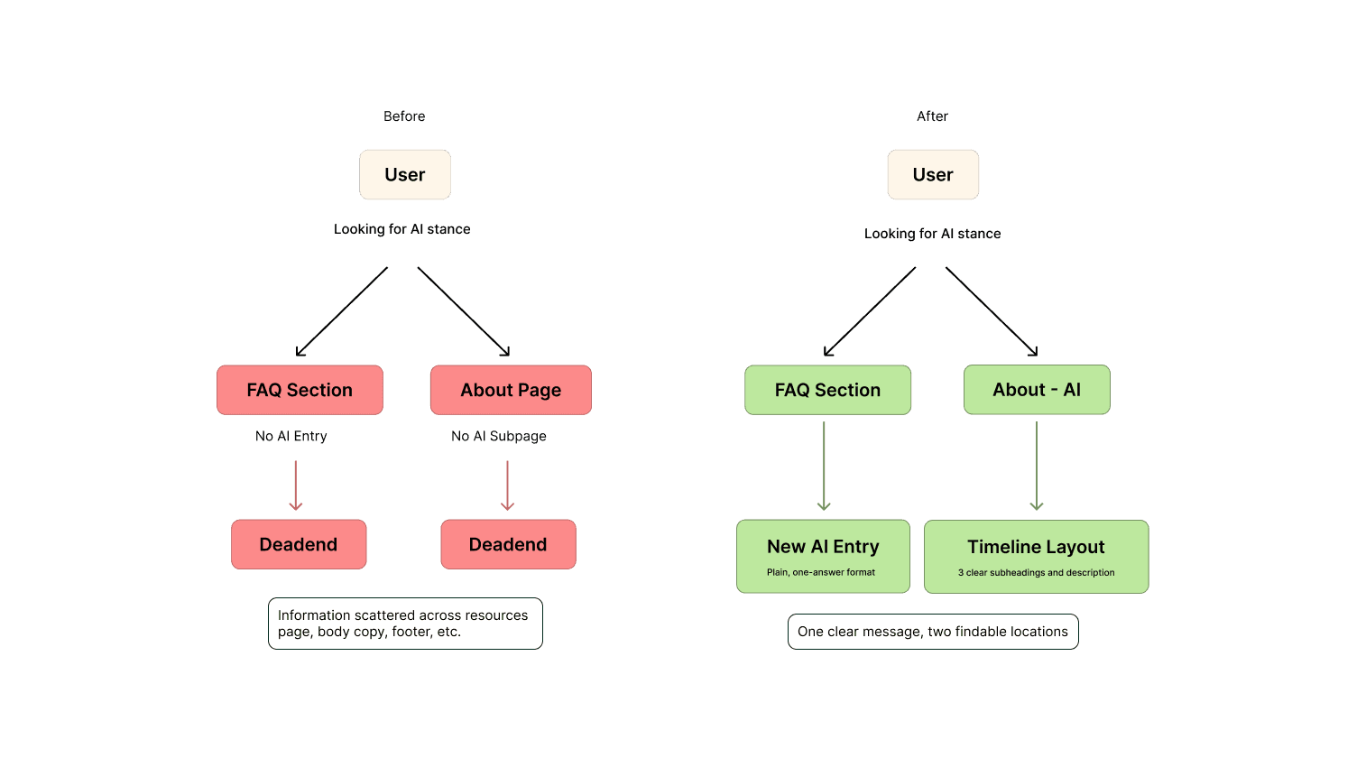
I designed two touchpoints:
1. An expanded FAQ entry
The existing FAQ already answered "What is MagnificentH?", "How does it work?", and "Who is it for?"; adding one entry on AI fits naturally into that pattern. The new entry reads plainly: MagnificentH protects your work by default and gives you the option to monetize through AI licensing if you choose.
One question, one clear answer, no contradiction.

2. A dedicated About subpage on AI
For users who wanted more depth, I designed a subpage under the About navigation (surfaced as "Artificial Intelligence" in the dropdown) that laid out MagnificentH's position in full.
Decision Point: Following the User's Mental Model to the Right Location
This is where I balanced three things: the client's strong attachment to their brand red (#FF0000), users' expressed fatigue with that same red on large backgrounds throughout the site, and the need for the design to feel implementable.
MagnificentH had already experimented with a timeline/line-based layout in other parts of the site, which told me they could recreate that pattern. I used it here: a vertical line guides the eye through three sections (Championing All Things Human, Giving Creators Agency, and Promoting Fair Compensation), with the red used exclusively as an accent color for the headings rather than the background. The background shifted to a muted light gray (#EAEAEA) with dark text, which immediately reduced visual strain while keeping the brand recognizable.

I went through three layout iterations before landing on this one. Earlier versions kept the red more prominently: one used it on section backgrounds, and another tried a full red-header approach modeled on the existing site. Both read as visually heavy in context and didn't solve the core legibility problem. Pulling the red back to accent-only made everything else work.
The final design:
Uses MagnificentH red (
#FF0000) for summary headings onlyLight gray (
#EAEAEA) background throughoutTimeline line structure borrowed from existing site patterns
Summary subheadings give users the gist at a glance; detailed captions expand for those who want more

Outcome: The Client Got Feedback They'd Never Had Before
The client received all deliverables, interview recordings, affinity maps, a detailed written report, and the high-fidelity mockups, and responded warmly. In their words: "You have done an amazing job, and I really appreciate all the insights and recommendations."
The stakeholder was particularly engaged by the usability data, having not had direct user feedback on the site before. Participants who were frustrated by the AI messaging were, notably, still enthusiastic about the platform concept; 7 out of 8 wanted to engage with the creative features once they understood them. That gap between concept appeal and execution clarity was exactly what the redesign aimed to close.
Reflection: Three Things I'd Bring to Every Project After This One
A few things I carry from this project:
Moderated interviews are irreplaceable for nuanced topics.
The AI finding didn't come from a survey; it came from watching participants narrate their confusion in real time, sometimes contradicting themselves across consecutive sentences. That texture only exists in live conversation.
Designing for implementation constraints is a feature, not a limitation.
Knowing the client would be building this themselves pushed me toward solutions that were actually coherent with what already existed on the site. The result felt more like MagnificentH than it would have if I'd designed it without that constraint in mind.
Clear information architecture is an act of trust-building.
MagnificentH was asking creators to trust a platform with their work at a moment when that trust is hard to earn. Every piece of confusing or contradictory messaging was eroding something real. Getting the information right (and putting it where people looked for it) wasn't a minor UX fix. It was the whole point.
Shasteny Maclang